
Feature Highlight: Uncover ISP Insights with Dynamic Delivery Statistics
GreenArrow has a long history of providing important and valuable data about how your email campaign performs and how to better reach and engage your audience. However, as useful as it is, the campaign-level data doesn’t tell us the whole story about important things happening deeper in the system.
In today’s GreenArrow Feature Highlight, I’d like to show you Dynamic Delivery, a tool that we think will change how you look at (and interact with) your SMTP Delivery data.
Dynamic Delivery statistics offer a visual representation of the email volume you’re sending along with how the ISPs are responding. While you’re busy sending emails, your GreenArrow software is quietly collecting your SMTP delivery data, just waiting for the day you need it.
When things are going well, Dynamic Delivery can give the confidence to continue sending with the plan you’re already using.
And when an incident inevitably happens, your sending data is already there, ready to help you piece together the puzzle of what exactly happened.
Dynamic Delivery’s default view shows a list of all of the domains you’re sending to across all of your IP addresses. This initial view allows you to identify the domains you’re sending the most email to and easily spot any areas needing more attention.
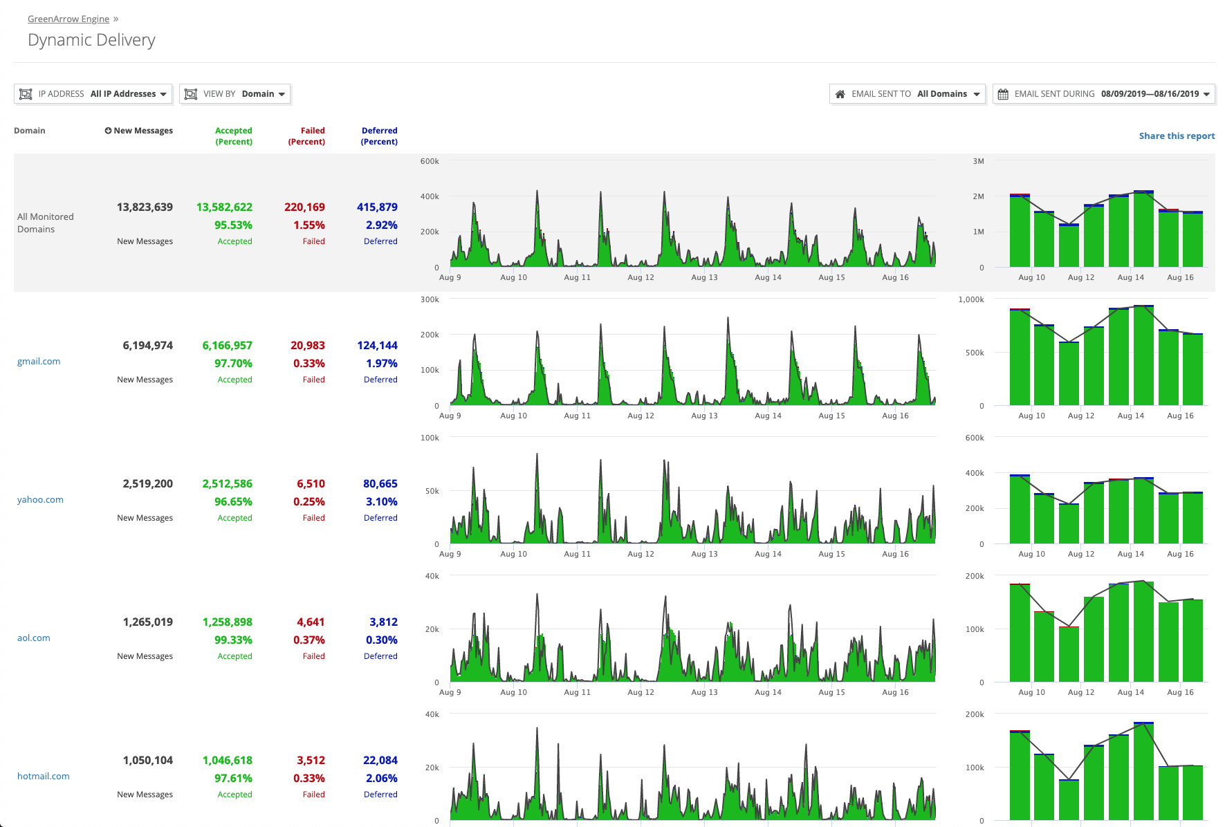
We call it Dynamic Delivery Statistics because you can adjust the focus of the report in many ways. With each new view comes a new visualization of the data and a different perspective on what exactly has been happening when GreenArrow tried to deliver your email.
There are four main options:
- IP Address: Report data from across all of your IPs, or just one at a time
- View: Group/organize the results by IP Address, Recipient Domain, or Throttle
- Email Sent To: Filter down the results to one or more recipient domains
- Email Sent During: Return results only for a certain period
Each of those four options can be mixed and matched to isolate the data you need. The results can also be sorted in ascending or descending order on each of the four columns.
In this example, I’ve limited the results to the emails delivered to comcast.net across all sending IPs:
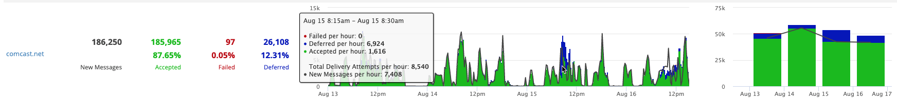
The interactive graph can show your per-hour stats by clicking anywhere on the graph and mousing over the slice of time you want to view in detail.
It is also possible to select a specific section of the graph to zoom in on for even more detail:

From the examples in the two images above, you can quickly notice a few important things:
- The volume of email hasn’t really changed in recent days
- Deferrals were high between 8:00 AM and 10:30 AM
- Failures were still quite low, so these emails eventually were delivered
- Similar volume after this issue cleared up did not result in a similar pattern of deferrals
This gives you the impacted ISP and the timeframe of the campaign(s) that could have caused a problem there. This information, along with the deferral responses in SMTP delivery results, can provide critical clues about what is wrong and how to fix it.
This is just one simple example of the ways Dynamic Delivery Statistics can help you gain insight into your deliverability. Take a look at our documentation for more details about this feature. If you don’t yet have access to this level of information, contact us to schedule a live demo of Dynamic Delivery Statistics and the rest of what GreenArrow has to offer!
Image credit: Freepik.com
Feature Highlight: Manage Everything with GreenArrow’s Unified Configuration File
Our development team is continually working on improving GreenArrow and pushing out new features. But sometimes those features are so…
Leader in the Email Industry Joins GreenArrow Email
Russell Fletcher, who previously served as Vice President of Sales at SparkPost, will help improve partnerships with customers and boost…